I have been writing all about my new life in Paris on a separate blog- http://ffioninparis.blogspot.com/
I know it's a bit silly having two different blogs but it's something Chelsea wanted me to do so they could check up on me I guess and mark my experience from a clearly defined start to end. It fills me with fear knowing that the end is fast approaching.

Sunday 13 November 2011
Wednesday 7 September 2011
Paris, je t'aime

It's been 4 days since my relocation to Paris and I am slowly getting used to its mysterious spirit and the foreign way of life it embodies. I have always wanted to experience living abroad and immerse myself in a new environment and foreign culture. After many years of dreaming, now that I am finally hear the reality is a little scary. Paris is so beautiful, so grand and awe inspiring I feel a weight upon my shoulders to impress and be accepted into her arms. In 1815, Honoré de Balzac famously said
"Whoever does not visit Paris regularly will never really be elegant."
Of all the cities I have visited in the UK, America, Europe and Asia I can honestly say that Paris is undeniably chic. The people, pavements and architecture are all polished. But also hidden in its alleyways are undercurrents of character, of decay and history that give greater insight into the pulse of the city and its inhabitants.
Thursday 23 June 2011
70s Style

Pivotal 70s designers


Bill Gibb fashion show

Jerry Hall in Issey Miyake's fashion show
The second talk at the UAL grad school was based on 70s style and design and was led by author Dominic Lutyens who has recently co-published a book on this subject titled '70s Style & Design'. As he felt it was a vastly unfamiliar and unwritten about decade in term of its style credentials.
The 70s was undoubtedly a creatively diverse decade. The post war baby boomers were now coming of age and new freedoms and ideas brought on a wave of liberalism and ‘que sera sera’ attitude. Or what we may commonly refer as ‘the hippy movement’. The vast unrest, which reached its culmination with extensive rioting in the late 60s, had brought about a new rejection of usual, accepted values. Equality rose to the forefront of this new preoccupation with feminism, gay liberation and black civil rights movements. All of which fall under the umbrella of the ‘Modernist Backlash’. The people turned away from mass production and instead chose to revert back to nostalgia, hence a revival of art deco style was seen. Barbara Hulanicki, the founder of BIBA was one of those who pioneered this new looking back consciousness.

Sarah Moon's 1972 Pirelli Calendar
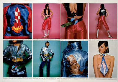
In terms of fashion, a defiant rebellion against conservatism and western ideas of beauty was observed. The Coquettes, described rather abruptly by the lecturer as ‘gay hippies from San Francisco’ were individuals mainly in their 20s and 30s who chose to wear exuberant, brightly coloured garments from thrift stores. This style movement had an immense influence on the art and design world. The fashion trends of the masses reflected ‘Coquette’ style by adopting a pick and mix approach. Wonder Workshop fashion label. Another clothing trend saw the wearing of utilitary clothing, perhaps another way in which to defy the accepted norms. Shoe designers such as the incredible Thea Cadabra pushed boundaries like never before with extremely outlandish and bold offerings.


Coquette member, 1971
Andrew Logan (an artist who has a gallery in Berriew, a little village near where I come from in Wales) can be recognized as one of the first individuals to challenge gender stereotypes, way before the phenomena of Boy George in the 80s. Celebrity icons such as Debbie Harry championed kitch style, which was readily embraced by a generation of urban, hip people. The Pointer Sisters in their glam rock platforms equally compelled the public to don their lurex and sequins.

Andrew Logan

Blondie, aka Debbie Harry


The Pointer Sisters
The world of interiors was dominated by a super graphics craze with bold stripe and dotted patterns. The work of artists such as Bill Topley and Frank Seller was particularly popular.

New York dining room decorated by New York artist Bill Topley

The Rainbow Room
The graphic album cover of Barney Bubbles was directly inspired by the striking approach of artist Kandinsky.

Considered graffiti graced the urban environment of cities such as New York, a form of self-expression typical of the time.
In terms of architecture, Denise Scott Brown’s Las Vegas flamboyant housing facades summarize the new wave of art/pop style, as did extraordinarily unusual creations such as Michael Car Michael’s armadillo house. It was interesting to learn that eco architecture also rose to prominence during this time. With the architect Paolo Soleri’s building within the Arizona desert offering high density construction as a counter-act to the urban scrawl.

Mesa city- the hypothetical desert city sketched by Paolo Soleri
This new wave of environmental consideration can perhaps be attributed to the 1973 oil crisis, which played heavily on many minds. Textile companies such as Laura Ashley sought inspiration from rural surroundings and adopted the ‘back to nature’ approach.
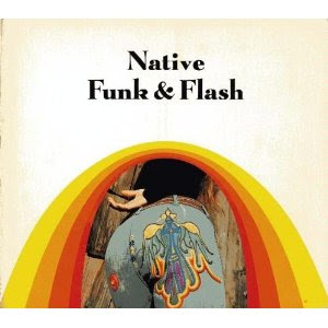
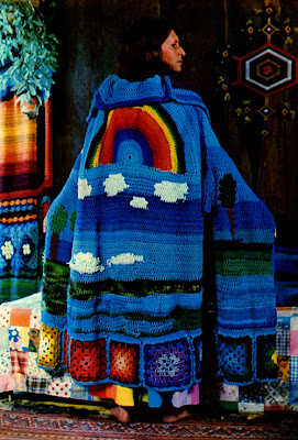
The 70s also heralded a new found interest in craft with the general idea that fine art and beauty were to be prioritised over functionality. The book ‘Native Funk and Flash’ promoted and encouraged the emergence of folk art and crafts such as patchwork and macramé gained extensive popularity.
Once again, the Mediterranean cookbook of Elizabeth David popped up as a key product, which can be attributed as being the cause of a domino effect of global discovery and cultural investigation.

It’s true, 70s style is vastly underrated and forgotten about. Although is may not embody the glamour and opulent style of the 20s, nor the swinging energy of the 60s but it is undoubtedly a melange of influences from all the preceding decades which has played an instrumental role in influencing what we know as style today. Without the 70s we wouldn’t have experienced Punk culture. And without Punk culture I’m sure the world today would be a duller place.
Margo Selby.
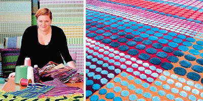
Margo Selby is one of the most talked about weavers about town. As an award-winning textile designer, her popularity has grown from strength to strength and her work has now gained instant recognisability amongst many. As a budding weave student I have extensive respect for her as she has successfully carved herself a brand spanning both the world of interiors and fashion. Her approach to designing textiles is often referred to as ‘bold’ by way of its unique structure, striking colour and geometric pattern.
Selby designs her fabrics on a handloom in her London studio, and then has them woven in specialist mills, which I believe are in India. It’s such a shame that manufacture cannot be conducted within Britain but I suppose this would push already high-end prices to an unaffordable level. I find her work particularly inspiring and her ability to play with colour, pattern, and proportions whilst respecting the satisfaction of repetition is extraordinary. Branching into textiles for interiors, fashion and lifestyle accessories shows the extend of her versatility and gives me confidence in the broad potential of woven fabric.
The other evening Cat and I attended a preview of Margo Selby’s new collaboration with Alison Willoughby. Titled The inexhaustible Object vs. International Lonely Girl, the collaboration is presented through an installation curated by Alison Willoughby which explores the skirt as a ‘cone or tube’, a collage of mark making and placement. Held at Margo Selby’s beautiful showroom in Bloomsbury, featured were a collection of Alison Willoughby’s skirts made from distinctive Margo Selby fabrics. Beautifully hand-constructed, Alison’s skirts were recognisable for their elaborate and intricate use of textiles. Ultimately they could be described as wearable pieces of art. The fusion of Selby’s graphic and metallic fabrics with Willoughby’s textile manipulation has culminated in an eclectic skirt collection.
Nowadays, collaborations are definitely extremely popular ways of working in the world of art and design. I think that a pair as opposed to one creative mind can combine to create something very new, exciting and even unexpected.
To be honest, I was more interested in looking at Selby’s exquisite fabric than the manipulated product of the collaboration. The complexity of the luxurious weave was enough to compel and please the eye. I am fond of Selby’s distinctive style and especially admire her ability to use colour in such an uninhibited way.

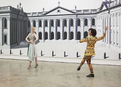
Mary Katrantzou & Pablo Bronstein at the ICA
 Mary Katrantzou's London Regency inspired dance costumes.
Mary Katrantzou in conversation with Professor Louise Wilson MA Fashion Design, CSM.
The ICA is currently exhibiting work by young fashion designer Mary Katrantzou in collaboration with surrealist artist Pablo Bronstein. Last week, I attended a lunch-time talk between Katrantzou and Professor Louise Wilson, head of MA Fashion Design at Central Saint Martins (the course from which Katrantzou graduated in 2008.) The designer was quizzed by her ex-tutor about the past, present and future direction of her work. I have been aware of the Greek fashion designer’s quirky garments for a few years and have held her creations in high regard. The main reason for this, being her aversion of succumbing to the common trend of minimalism showcased by the majority of young designers.
Katranzou was first and foremost a textile design student focusing on printed textiles for fashion. This grounding in surface design is evident and perhaps even dominant throughout all of her womenswear collections. She admits to being obsessive about the notion of detail, proportion and subverting it.
The designer grew up in Greece, which harboured her appreciation of classicism and the decorative arts. She claims to be directly influenced by the world of interiors and especially indulgent, opulent decorations such as Faberge eggs and Ming vases. Diana Freeland’s flat is described as one of her main influences. Through her prints, Katrantzou builds a fantasy of fake overindulgence evoking an imaginary era. As far as she is concerned, less certainly isn’t more and her busy, eye catching imagery is such a welcome contrast from the widely favoured minimal approach to fashion design.
Like the majority of textile designers, Katrantzou possesses an inherent love for colour and texture, which sets her apart from her contemporaries, such as the practical, simple design of Celine. Katrantzou has in fact carved herself a niche and indeed since her first show in 2008, the popularity of print on the catwalk has gone from strength to strength. This point of newness has given fashion designers the ability to make an easy statement as print can help define you. In addition the limitations of print design are endless with boundless freedoms to explore new territory and room for further development.
Katrantzou professes other points of interest to be contemporary references re mixed and re used such as music. However, she derives the majority of her imagery from the world of interiors and inanimate objects, which she envisages belong within elitist homes.
Although admittedly, the visual appeal of her garments hold extensive importance, Katrantzou has also sought to explore a deeper, social meaning. She plays with juxtaposing the idea of a setting by encasing people in a scene rather than the more natural opposite. By changing the role of a woman in a dress she hopes to open questions and debate.
Her s/s 11 collection is one I can conjure in my memory vividly. Much of the jewellery worn took direct influence from Pablo’s work. In addition, her idea of putting the room onto the woman is further explored by extending this concept from print into silhouette, e.g. through the wearing of lampshade skirts. Katrantzou successfully takes an art and design concept and subverts it into the world of fashion, which is quite a brave achievement.

She reveals how her process of working is far more complex than what first meets the eye. The hyper-real imagery of her prints is created from scratch. She initially builds her own set through various magazine clippings, e.g. an Victorian chair, the flower arrangement from a hotel lobby etc. Each object is then changed. For example she will change the upholstery or legs of the chair. This set is then created as a digital collage, which is then adapted in proportion and scale so that its composition is engineered around the female figure. A good example of this consideration of the female figure is her range of perfume bottle printed dresses, which elude to and enhance an hourglass shape.
A sense of performance with overwhelming colour is important in Katrantzou throughout the designing process, despite saying that she had recently learnt that the human retina can only digest 36 different colours at one time.
Professor Wilson questioned the designer on her views regarding whether fashion shows were still relevant. I suppose with the rise of digital media and soaring costs and expenses this question must be at the forefront of many a designers mind. Katrantzou unsurprised dismisses their irrelevance. She believes that fashion shows hold an incredible ability to move you emotionally and that there is an incredible sense of power in seeing clothing choreographed. She claims it necessary for her garments to have life and energy inhabiting them.
As well as garments, Katrantzou’s expertise also stretch to the field of jewellery and she has produced a number of monolithic pieces. Her mother owns a furniture making factory in Greece and so she was able to work one on one with a specialist wood carver. She said she was faced with a challenge in convincing them to use their extensive expertise and knowledge in a new and different way and it took great strength to convince them to do something they had previously claimed they couldn’t. I was particularly inspired by this idea of using traditional skill and expertise in a new, original way.
Katrantzou said that she was particularly inspired by Bronstein’s subject matter, architecture and his work as an interdisciplinary artist. Looking around the exhibition there are so many similarities between their styles and both favour to concentrate on grand, elegant buildings. It therefore seems only natural that the two should collaborate.
When questioned about her future in the industry, Katratzou definitely hopes for more collaborations. She is also keen on using her print in different contexts as at the moment she has limited her work to fashion. A natural transition would be to venture into the world of interiors. Her ambitions to move away from fashion are interesting. She strongly believes that fashion is marginalized within the arts as it is such a commercial industry. The paintings of artists hold longevity whereas the world of fashion requires a continuous need for production of new and exciting collections each different and more impressive than the previous. As a fashion designer you must constantly challenge yourself and the necessity of time doesn’t always allow for room to breath or develop creativity. This endless feeling of pressure makes designing for fashion a difficult process to sustain. Many designers consequentially chose to shy away from this pressure and focus their energies into a more commercial route. This negative perspective of the fashion industry resonated with a documentary I watched recently on the life of Alexander Mc Queen. The extreme pressure placed upon him led to a life of grief and a constant grapple to be better and to reach an unattainable level of success. Despite wowing audiences with his highly theatrical, groundbreaking shows and boundary pushing garments he was always pressured to push his work further and make his shows more impressive and original than the last. The documentary was very moving and actually quite upsetting. It revealed the truth behind the glamour, the ugly side of fashion. It also made me question whether, as a textile designer this really the industry I want to enter?
Dancers perform in Mary Katrantzou's specially designed costumes at the ICA.
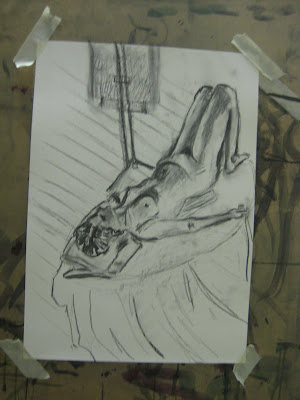
20th June Life Drawing

This week’s life drawing was perhaps a step back from the success of the last. But I suppose you win some you lose some. What didn’t help was the constant chatter between the tutor and the life model. I do wish they would go for a coffee before to talk about Italy because forgive me if I’m wrong but sketching a moving life model isn’t exactly what I signed up for! The tutor also brought along her adorable dog…..another distraction. Another student told me that once a life model didn’t turn up so the whole class had to sketch the dog instead! To be honest I think I would rather settle for a moving human that a dog. The tutor encouraged us to really accentuate the muscles of the body even if this led to an element of surrealism. After having previously taught not to over darken my drawings, I feared I could get carried away. I am quite pleased with the tone I achieved as I believe it adds a strength and presence to the body.
Saturday 18 June 2011
Graduate Fashion Week

Last week I took my place at Manchester Met's Graduate Fashion Catwalk to see the work of my highly gifted fashionista friend Esther Phillipson. Having not seen Esther's work since we did our foundation course together I was totally unsure what to expect but knew that knowing Esther she would have created a highly ambitious, innovative collection. I certainly wasn't disappointed. Being a bit tired of the ever popular minimalist look of young emerging fashion designers, Esther's work refreshed me with its vibrant colour, vivid print and tactile juxtaposing textures. Her garments had a distinctive ethnic vibe enhanced by her use of folk and knitted motifs. Her melange of coloured sheepskin, knitted stripes and floaty, feminine fabrics came together in both a playful and original way. Careful consideration had been given to colour and texture to create clashes that both caught the eye and stayed in the memory. As a textile student, Esther's fashion collection excited me immensely with having both a fantastic visual appeal but also considerable technical skill (her knitwear must have taken absolutely ages!). I predict a glowing future for this young graduate. Congratulations Esther!
Tuesday 14 June 2011
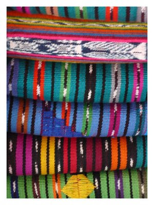
Malaysian Weaves

During my recent trip to Singapore, I visited the Asian civilisations museum, which hosted a whole spectrum of incredible South Asian textiles. Some were ancient yet still in prestine condition whilst others were modern day creations. I was struck by their intricacy and beauty. Not only were the textiles a demonstration of incredible craftsmanship but they also bore contemporary relevance to the lives of the communities and cultures in which they were created. This meaning, deeply embedded into each woven strand of the cloth highlights the importance of textiles and that cloth with a functional purpose can also be artefacts of beauty.
After this enlightening experience I was surprised to return to my drawing school and find an exhibition of Royal Malaysian weaves. Within Malaysia, traditional arts are more than simply specimens on display in a museum. Their role means that they play an important part in a living tradition, which must be nurtured and continually renewed by every generation in order for their purpose to be recognized in contemporary life.
Throughout the exhibition, the importance of tradition becomes apparent. Despite the word yielding many negative connotations in modern society, the exhibition really demonstrates how tradition it is something, which can never be outdated. The principles of tradition are both timely and timeless and transcend the fleeting trends of fashion and style. Equally, traditions are universal in promoting a meaningful foundation for the art of today. Crafts are integral to Malaysian life, from birth through to death. During this year, traditional crafts have certainly played an important part in informing the development of my work. Skills in crafts such as hand knitting, macramé, hand knitting, smocking and pom-pom making can be adapted and approached with a contemporary, unconventional eye to create something very unusual. This importance is probably one of the most advantageous things I have learnt this year.
Back to the exhibition and another point of interest is the importance of cultural exchange. One can consider this to be vital in helping to spread understanding of how universal principles can be applied on a local level. In addition it affirms cultural identity and uniqueness. This theory also applied to my essay study in which I investigated traditional Chinese dress and its cultural significance. I believe that the exchange of textile goods enable us to cross boundaries that separate cultures in order to discover the unity and universality of creation.
The imagery of Malaysia dotted around the exhibition help one understand the source of inspiration for such exquisite textile pieces. The natural world for example the wealth of tropical flora along with the striking Malay architecture, for example in Kuala Kangsar, the royal town of Perak strongly influence symbols, design and colour. On display are fine examples of Songket (gold thread weaving) and Tekat (gold thread embroidery). The colour gold bears considerable meaning for the Malay people for it is symbolic of the sun and spirit.
Malaysian textiles themselves can also be considered extraordinarily meaningful to Malay culture and have inspired other area of the arts such as poetry. Equally, they play an essential role in ceremonial rituals and daily life. Whereas Chinese historical garments have been banished to having a novel, purely decorative or touristic role, it is heartwarming to realize that this is not the case for all Asian cultures.
The role of the textiles within this exhibition can be categorized into possessing one of two roles-
1. Those intended for clothing and decorative purpose.
2. Those, which transcend utilitarian function to become indicators of cultural identity and prestige.
Historically, textiles were considered a prime commodity and a vital means of exchange and dignitaries were honoured with gifts in the form of textiles and clothing. In Malaysia the gift of textiles was considered one of the highest honours to be bestowed at Malay courts. Today, we can pick up a T-shirt on the high street for £2.


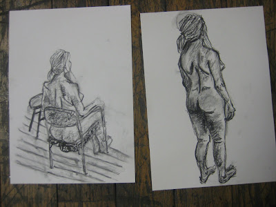
Monday 13 June 2011
New techniques at Life Drawing
Despite another crazy tutor at Life Drawing this evening (I really don't know where they find them!), I really enjoyed the class. I took the advice of last week's tutor in working on a smaller scale so that more detail can be completed in a short time. This was not to this week's tutor taste who believed bigger was better. I really enjoyed working on a small scale. It was much less overwhelming and I liked taking the time to add tiny bits of detail. Also, I luckily had a pencil on me which was essential when working so small as charcoal is far to messy and better for large scale drawing. I liked mixing my media's as I believe it gave the images more depth and character. Definitely a technique I will explore further...maybe even adding colour washes, who knows! We were also encouraged this week to draw around the model, i.e. floorboards other student's easels etc. This is something I am definitely not used to and I think detracts significant attention away from the model. I understand it's important to draw the model within a spatial context but I think this can lead to things getting a little too busy.


Monday 6 June 2011
Awful Life drawing
When it comes to life drawing, the phrase 'practice makes perfect' definitely applies. After a lengthy 3 week break from life drawing I knew last night would be a struggle. Our model was once again Tom, a Chinese man with long flowing silver hair. We had a new tutor who instructed Tom to create the most obscure twists and poses on top of a small box! Each one was (painfully) held for about 10 minutes which was really challenging to capture so quickly. I suppose the advantage of such strange poses means that your eye really has to work hard at translating what you can actually see. In say a normal standing pose, the brain can already judge placement and proportions so a lot of work unfortunately ends up becoming from memory. The tutor did not really give any guidance but spoke sporadically of Italian chapels, limes and mythology!


Sunday 22 May 2011
Ikat dying at home.


After such an inspirational day at Mary Restieaux and having been introduced to the wonderful world of Ikat dying, I decided that I would use the technique in my current project. I set up a dye workshop in my chaotic halls of residence kitchen and with 5 bowls of different colour dye bubbling on the hob, I began the dip dye process. I decided to dye ecru silk 2/60. I chose silk because I think it can create such a luxurious and rich looking fabric which would be ideal for the high end interiors market. However, on reflection I should have probably used a much thicker thread as this would have displayed the ikat pattern far clearer as opposed to being drowned out by the vibrant stripes of my colourful warp. Some of the yarns dyed were to be used for giant wrappings! It was fun to see the scale of my colour palette really exaggerated.
I initially wrapped the yarn around my A2 card to get the correct circumference so that the undyed ikat stripes would line up. I then tied clear polythene bags and string around selected sections of the yarn to act as the resist before dip-dying. When dry, I wound the hanks onto cheeses. I believe these look like beautiful creations in their own right!

These were then wrapped around mountboard in stripes alternating with block colour threads.
Below is an image of some of my work presented for assessment. My giant wrappings are on view in the background and attracted a lot of admiration from my uni friends who realize the extent of time and patience needed to complete them!

Monday 16 May 2011


Monday 9 May 2011
Garden of Eden
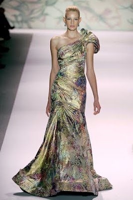
It seems that the whole world has gone garden mad! It has even hit the fashion industry with Monique Lhuillier's S/S collection based on the theme 'Garden of Eden'. The theme of 'Garden' really does offer endless scope and ability to take your work in any direction. I however have chosen to explore the tropical offerings of botanical gardens such as the National Botanic Garden of Wales and Kew Gardens. Bright, exotic colours are perfect for interiors and a nice break from all the dull beiges and taupes that have adorned our houses for the past few years.


Making a warp


Today was very intense. We learnt the process of making our own warp. Initially figuring out all the technical ends per inch detail and then constructing the warp on a warping mill. We then had to start the long process of threading up a loom. It was very physical and far more complex than I had ever imagined. And I never realised how useful my GCSE maths would be for a textile degree! Despite this it was such an interesting and exciting day. Knowing and being able to complete the whole process from start to finish is extremely gratifying I can't wait to start weaving and designing for our interiors project.
Subscribe to:
Posts (Atom)